
How to Paint a Room to Make It Look Bigger
Painting a room is more than just adding color. The right shades, finishes, and painting techniques can make even the smallest room feel open, airy, and inviting. Light colors reflect more light, clever accent placement adds depth, and using the same color on walls and ceilings removes visual barriers. Planning your paint strategy carefully helps you get the most impact without costly renovations. Learning how to paint a room to look bigger lets you enjoy a brighter, more comfortable space every day while highlighting your home’s style and personality.
Best Paint Colors That Make a Room Look Bigger
Choosing the right color is one of the easiest ways to make a room feel more spacious. Some shades reflect light better, create a sense of depth, and make walls feel farther apart. Understanding how different tones affect perception helps you pick colors that expand your space visually. Using these proven choices lets you enjoy a brighter and more open room without changing the layout.
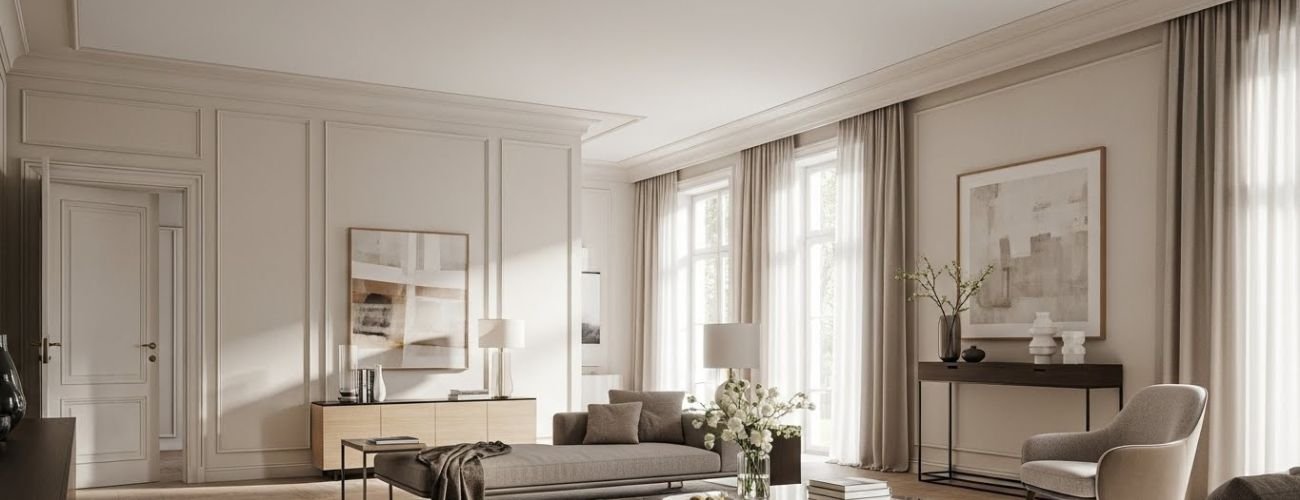
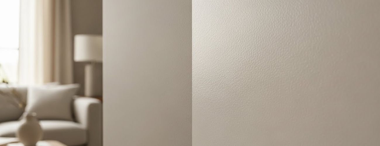
Light Neutral Colors and Why They Work
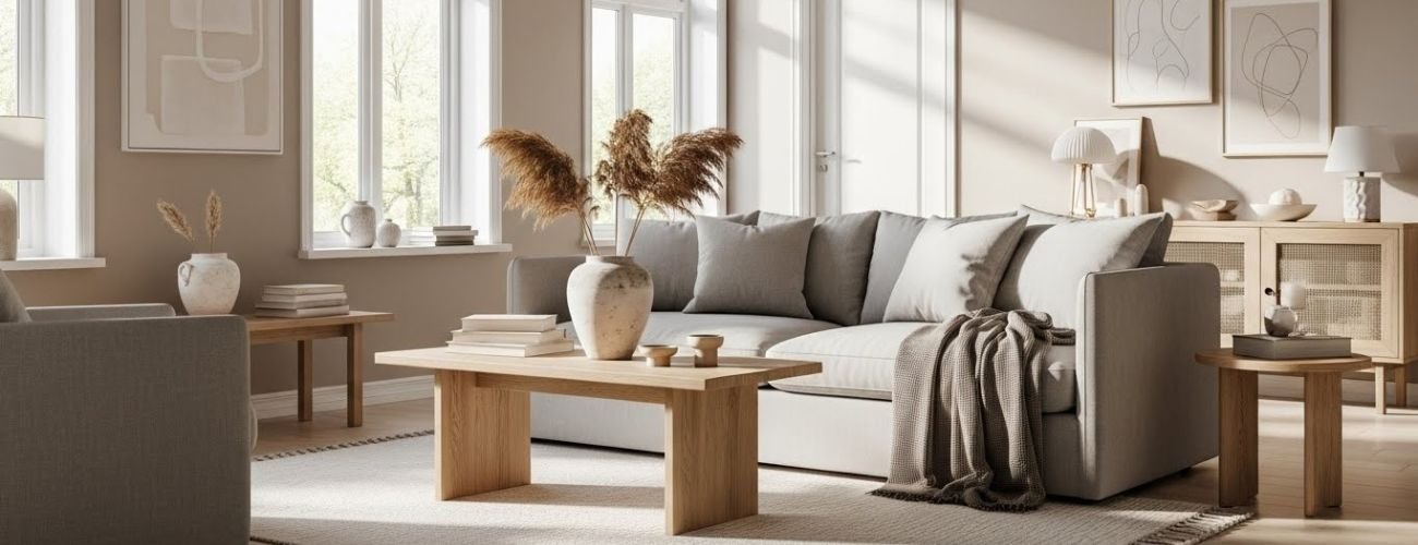 Light neutral colors like beige, soft gray, and cream reflect natural light, making walls appear farther apart. They create a clean, calm backdrop that opens up the space visually. These shades work well with almost any furniture style or decor. Neutral tones also allow other design elements to stand out without overwhelming the room.
Soft Pastels for Added Depth
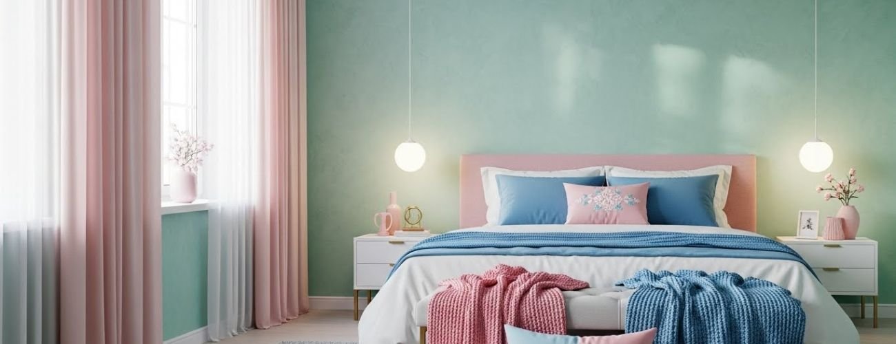 Soft pastels such as pale blue, mint green, or blush pink add subtle color while keeping the room light. They create a sense of airiness and make walls feel less confining. Pastels also help highlight architectural details without drawing attention to corners. Using pastel shades can make small rooms feel more playful and open at the same time.
Cool Tones vs Warm Tones
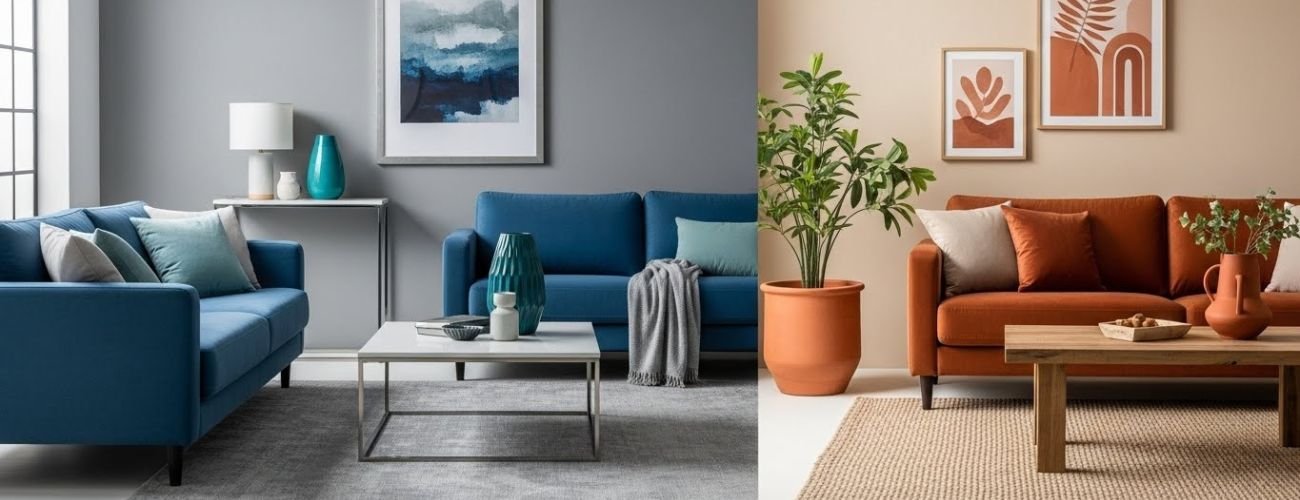 Cool tones like blues and greens make a room feel calmer and larger because they visually recede. Warm tones like soft yellows or light peach can make a room feel cozier but may slightly shrink the space. Balancing cool and warm shades strategically lets you create an inviting yet spacious feel. Using cooler shades for main walls often works best for small rooms.
Why White Still Works When Used Correctly
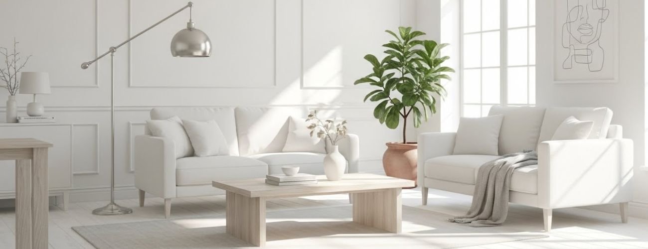 White reflects the most light, instantly brightening any room and creating the illusion of more space. Pairing white walls with light-colored ceilings enhances height perception. To avoid a sterile look, mix in textures or subtle accent colors. When used thoughtfully, white remains one of the most effective ways to make a room appear larger.
How Ceiling Paint Can Make a Room Feel Taller
The ceiling plays a key role in how tall a room feels. Painting it thoughtfully can create the illusion of height and open up tight spaces. Lighter shades on the ceiling draw the eye upward, making walls appear taller. Choosing the right finish and subtle color changes helps enhance vertical space without overpowering the room.
Lighter Ceilings and Height Illusion
- Use pale shades like white, cream, or light pastels to make ceilings feel higher.
- Lighter ceilings reflect more light, brightening the entire room.
- Dark ceilings tend to feel lower and shrink the space visually.
- Pair light ceilings with slightly darker walls for a natural height effect.
Using Flat vs Satin Finishes
- Flat finishes reduce glare and create a smooth, seamless look.
- Satin or eggshell finishes reflect more light, subtly enhancing height perception.
- Avoid high-gloss finishes on ceilings as they can highlight imperfections.
- Choose a finish that complements wall textures and room lighting.
Subtle Ceiling Color Shifts That Work
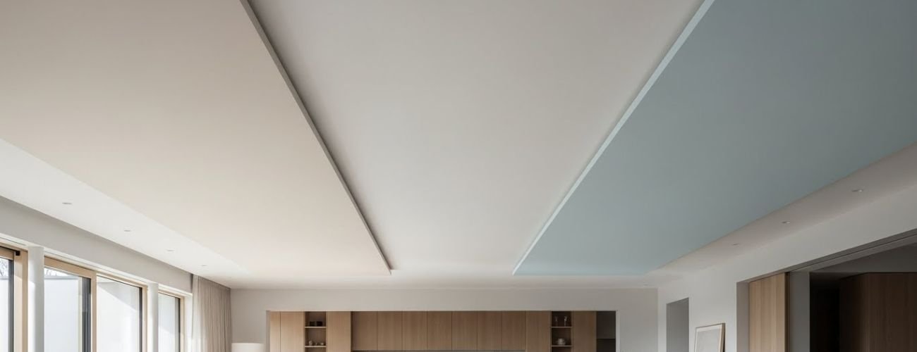
- A shade lighter than the walls can make the ceiling feel taller.
- Soft gradient effects can add depth without noticeable contrast.
- Avoid strong color contrasts that visually lower the ceiling.
- Neutral or pastel tones work best for small rooms with low ceilings.
How Horizontal and Vertical Paint Tricks Change Space
You can use paint direction to change how a room feels without moving furniture. Vertical and horizontal paint techniques create visual illusions that make walls appear taller or wider. These tricks work best when combined with the right colors and finishes. Even small adjustments, like stripes or two-tone walls, can make cramped spaces feel open and airy. Learning how to guide the eye with paint lets you maximize your room’s visual space and create a more comfortable environment.
Vertical Color Flow for Height
Painting walls with vertical stripes or extending a color from floor to ceiling draws the eye upward. This technique makes ceilings feel higher and rooms appear taller. Lighter shades enhance the sense of height, while careful stripe placement prevents the design from feeling overwhelming. Using vertical flow strategically adds elegance and openness to small spaces.
Horizontal Color Balance for Width
Horizontal painting techniques spread visual focus across the walls, making rooms feel wider. Two-tone walls or soft horizontal stripes help break the vertical monotony and expand the space visually. Muted colors work best to keep the effect natural and subtle. This method is ideal for narrow rooms that need a broader appearance.
Using Stripes Carefully
Stripes can add depth and interest while making a room feel larger if applied thoughtfully. Keep the colors light and the stripes proportional to the wall size. Too many contrasting colors can make a room feel cluttered or smaller. Using stripes with complementary wall and ceiling colors enhances the open feeling without overpowering the space.
Common Paint Mistakes That Make Rooms Look Smaller
Even small painting errors can make a room feel cramped instead of open. Choosing the wrong colors, neglecting ceilings, or ignoring lighting can shrink the space visually. Understanding these mistakes helps you avoid them and create a room that feels larger and more inviting. Being mindful of color, contrast, and light ensures your space looks airy and well-proportioned.
Too Many Colors
Using too many colors in one room creates visual clutter and breaks up space. This can make walls feel closer together and the room feel smaller. Stick to a simple color palette to maintain openness and flow.
Dark Ceilings
Painting the ceiling too dark draws the eye downward and shrinks the room’s perceived height. Light ceilings reflect more light and make the space feel taller. Always match ceiling color to the walls carefully for balance.
Heavy Contrast Borders
Bold borders or extreme color contrasts along walls can break up the room and limit the sense of space. Subtle transitions help walls flow visually. Avoid sharp lines that draw attention to corners.
Ignoring Lighting Conditions
Poor lighting can make even light colors appear dull and the room feel closed in. Consider natural and artificial light when choosing paint. Adjust shades to match the room’s brightness for a more spacious look.
Conclusion:
Painting a room is one of the easiest ways to create a sense of space without expensive renovations. Choosing the right colors, using clever ceiling and wall techniques, and guiding the eye with vertical or horizontal paint tricks can make even the smallest room feel larger and more inviting. Avoid common mistakes like dark ceilings, too many colors, or ignoring lighting, and your space will feel bright and comfortable. Thoughtful planning, the right shades, and simple visual tricks help you enjoy a room that feels open, airy, and full of life every day.
